Shipt
Routes Dashboard
Designed and shipped a net-new dashboard empowering Operations team to efficiently monitor last-mile delivery drivers and routes in real-time.
Last-mile delivery
Launched

TLDR
This project results in 100% better user satisfaction.
Context
Shipt's last-mile delivery service depends on gig drivers to claim and deliver orders to customers on time. The Operations team responsible for monitoring this process had no real-time visibility into route statuses — they were stitching together data across Slack, Snowflake, Google Sheets, and internal tools just to do their jobs.
I designed a dashboard to fix that. I returned the following summer as a repeat intern to iterate on the live product.

Inside a Target sortation center where gig drivers pick up orders to deliver.
Problem
No visibility on the status of gig delivery drivers
Shipt operations are complex, large-scale, and lack visibility.


WHO ARE THE USERS?
Empowering Shipt's last mile delivery operations team
👤 Ops Specialist
Primary user group.
Objective: track routes to ensure they're delivered on time.
Interacts with detailed data to closely monitor routes and drivers.
👤 Ops Managers
Secondary user group.
Objective: develop business strategy.
Interested in higher-level data.
Painpoints
Data overload and inefficient current tools
From shadowing the Ops team, I discovered 2 main pain points.


Automated Slack alerts are not useful because the data is not real-time and repetitive.
User painpoint
"The current tools are effective in that we can typically find what we're looking for. In terms of it being efficient - it's not."
Shelby, Ops Specialist
User journey
A day in the life of an Ops Specialist
An Ops Specialist's goal is to move the routes through the different stages and get routes delivered on time. This journey map allowed me to analyze their decision making process to better understand the use case of the dashboard.

Caption
Card sorting
What data is important?
To understand what data mattered most, I facilitated a card sorting activity with four participants — two Ops Specialists and two Ops Managers. From this, we aligned on six key metrics to surface in the dashboard: number of orders, number of routes, number of drivers, cost of incentive pay, route reschedules, and route sizes.
Number of orders
Number of routes
Number of drivers
Cost of incentive pay
Route reschedules
Route sizes

V1 iterations
Wireframes to hi-fi prototype
With an understanding of the user flow and a set of metrics to display, I started the designing phases beginning with wireframes and gradually increasing fidelity.


Designing through feedback loops
Design deep dive
Displaying metrics
Goal
Organize data to make it meaningful.
Solution
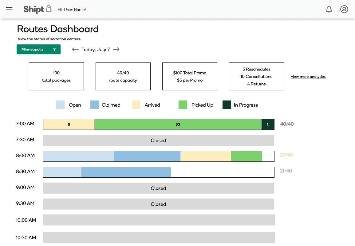
The metrics layout ensured that the most important data points are shown in a way that is useful and actionable for users.
Explorations

Exploring grid format but it took up too much precious real estate on a data dense screen.

I explored a single line which organizes the values more.
Final design

Finally settled on a left aligned card for scannability.
Visualization techniques
Goal
Use different channels to convey information
Solution
I used color and size to as data visualization channels. This allows users to quickly gauge the warehouse and route statuses.

User Testing
Gathering feedback after launch
For version 2.0, there were specific needs that I had to address:
Further integration with current workflow would increase efficiency
Visual elements need to be changed for accessibility
Workflow integration
Goal
Users need to take actions on specific routes.
Solution
Make the bars interactive to allow users to drill down to route level in a table format.
Increasing accessibility
Goal
Make the colors more accessible for color-blind users.
Solution
Colors needed higher contrast. I also expanded to using purple and green to match the statuses to user mental models.
Before

After

Impact
Helping users and meeting business objectives
I handed the design off to engineering. When I returned as an intern the following summer, the dashboard was about to be released and I got to see the product go live.
🛠️
User benefits
Users will experience will save time and effort needed to complete their tasks.
User feedback
"I cannot tell you how much everyone on Ops has found it helpful especially when we've been dealing with capacity issues (I actually don't know how we've managed so long without it)"
Shelby, Ops Specialist
Reflection
Going from 0 to 1
One challenge was understanding the complex business operations workflows which I leaned my my PM and users heavily on. Another challenge was that not every idea made it into the MVP and I learned to prioritize features to meet business goals while balancing user needs.
I had the unique opportunity to launch a feature that I designed from 0 to 1 and then iterate on it as a return intern. I learned how to collect and weigh the needs of different groups of users.